Using Multiple Timeframes Analysis in Forex Trading
Using Multiple Timeframes Analysis in Forex Trading
Today’s retail traders enjoy the benefits of using computers. Multiple timeframes analysis, one of the most complex ways to look at markets, has never been easier.
Back in the day, traders tracked charts using pen and paper. While an accurate method, it involved plenty of time and resources wasted.
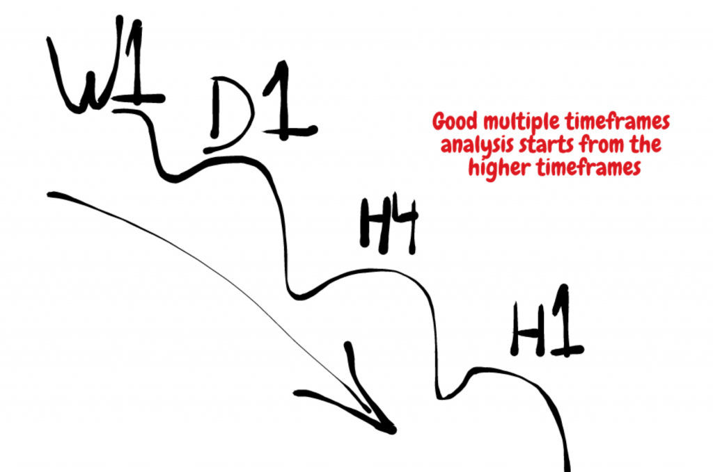
A complete multiple timeframes analysis in Forex trading always starts with the bigger timeframe first. In other words, instead of a bottom-up analysis, a multiple timeframe analysis is a top/down one.
Such an approach has multiple advantages, but the main one is that it offers a clear picture of the market.
Any market!
Long before finishing reading this article, you’ll learn to appreciate a multiple timeframes analysis. I will provide a plenty of reasons to support it.
- First, as mentioned already, a multiple timeframes analysis offers a complete view of the market. It helps in understanding where the price is on the grand scheme of things.
- Second, using a multiple timeframes analysis approach offers a complete trading solution. Traders apply all styles, on the same market (currency pair).
Scalpers “play” on the lower timeframes. Swing traders enjoy the hourly and four-hour timeframes setups. And, investors keep an eye on the bigger timeframes.
Why not using all styles on the same account?
Or, why not trade different styles on different trading accounts?
Finally, a multiple timeframes analysis keeps the trader on the right side of the market. It also does filter the noise on the lower timeframes.
With this article, my aim is to introduce the power of using a multiple timeframes analysis in your trading.
A warning from the start: it is a complex but rewarding process for the dedicated trader!
Contents in this article
- What is a Multiple Timeframe Analysis?
- Default Timeframes Offered by the MT4 Platform
- M1 – the One-Minute Chart
- H1 – the Hourly Chart
- Different Servers Time
- H4 – The Fixing Timeframe
- D1 – Now Your Talking
- Back to the Brokerage Houses
- The Bigger Perspective
- Steps for a Multiple Timeframes Analysis Strategy
- Using a Multiple Timeframes Analysis Strategy
- Summing it all up
What is a Multiple Timeframe Analysis?
As a price action trader, multiple timeframe analysis fits my trading style perfectly. By offering an unbiased, overall picture, it builds an equilibrium point between different time perspectives.
Like it or not, timeframes have different importance in the day-to-day market analysis. For instance, what is the one-minute chart telling you? Or, more precisely: does it offer meaningful information?
How about the hourly? Or the four-hour, daily, weekly or monthly?
Before compiling all the information together, in a true multiple timeframe analysis, let’s have a look at the different timeframes and their importance.
Default Timeframes Offered by the MT4 Platform
The MT4 or the MetaTrader4 platform comes with the following standard timeframes by default:
- M1 – one-minute chart
- M5 – five-minute chart
- M15 – fifteen-minute chart
- M30 – thirty-minute chart
- H1 – hourly chart
- H4 – four-hour chart
- D1 – daily chart
- W1 – weekly chart
- M1 – monthly chart
All of them are important for different stages of a multiple timeframes analysis. However, depending on the trading platform, traders have access to other timeframes too.
For instance, the M2 (two-minute chart) or H2 (two-hour chart) exist, and some traders use them when doing technical analysis. As always, keeping things simple helps.
M1 – the One-Minute Chart
As a rule of a thumb, every trading platform that starts with the letter “M” offers short to very-short-term market information. Therefore, scalpers value highly this information in their trading strategy.
The M1 chart is irrelevant from a multiple timeframes’ analysis point of view. At best, traders use it for scalping their way during illiquid trading sessions.
Asian traders love it. Because the Forex market stands still most of the Asian sessions, traders active during the Asian session have a hard time catching swing trades.
As such, they move to the lower timeframes like M1 and use oscillators to buy the lows and sell the highs of the session. Because the Asian session ranges so much, the probabilities favour an overbought/oversold approach using oscillators.
- One drawdown of using such an approach is the increased risk. Traders pile on a position forced by the tight ranges. Hence, they increase the risk while only a small move against them proves fatal.
- Another drawdown is the increased use of trading algorithms or robots. Because of that, the market spikes higher or lower on no news at all, seemingly without any justifiable reason, as algorithms dominate the Asian price action session.
As such, traders using M1 most of the times end up wasting both precious time and resources trading on a dangerous timeframes. That is if trading is manual or with Expert Advisors.
Quant firms love such timeframes. In fact, they go even below M1, trading for the 7th, 8th or even 9th decimal of a quote.
But again, from a multiple timeframes analysis, M1 is useless for the inexperienced. As, in fact, are all other timeframes that start with the letter M.
They all share the same risk and provide little or no information as to where the market actually goes. Hence, a multiple timeframes analysis starts at the H1 chart.
H1 – the Hourly Chart
Perhaps you all wonder why multiple timeframes analysis stops at the H1 chart and not starting with it. The answer is that a true multiple timeframes analysis is a top-bottom, not a bottom-up analysis.
As such, it begins with the highest timeframes possible (ideally multi-year charts) and goes lower to the smaller ones. And yes, it preferably stops at the hourly chart.
How come?
Let’s put it in simple terms: anything below the hourly chart is noise from a multiple timeframes analysis’ perspective.
Coming back to the H1 chart, it is one of the most important timeframes of them all. The answer comes from its simplicity, as brokers cannot alter that much the information provided.
Different Servers Time

Cost considerations make a broker from the United Kingdom to place the servers in Ukraine, for instance, or one from the United States to have their servers in Asia. It’s just cheaper, that’s all.
Because of that, the charts show different information on almost all bigger timeframes. Candlesticks simply start at different times.
For instance, a broker having the servers on a GMT+2 location will have the H4 candlestick opening and closing at different times than one having the servers on a GMT location. The two hours difference between the two physical locations will reflect differently in a four-hour chart.
The same holds true with a daily chart: the daily candlestick starts and closes with a lag of two hours.
Now, this is an important aspect of today’s trading. Imagine you trade simply from a technical analysis perspective.
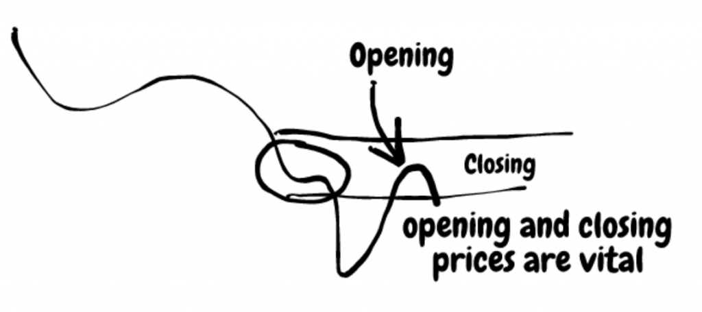
As such, opening and closing prices are vital. That’s especially true if you use expert advisors to take action at the opening or closing of prices. With different information on different brokers, different results appear.
Hence, one winning strategy on one broker might prove disastrous on another. And that’s only because timeframes were altered due to the server’s location.
So why is then the H1 chart so important?
Well, you can’t do much to alter a sixty-minute chart, do you?
An hour is an hour around the globe: it starts at the top of the hour and sixty-minute later the candlestick closes. Believe it or not, brokers use various tricks to alter the information, so they get an edge from everything possible.
That’s especially true if you happen to deal with market makers. But that’s a totally different story and can wait for some other time.
H4 – The Fixing Timeframe
The solution to the problem listed above is to use the same server time on all of your analysis. Simply ask the broker to provide you with the right charting info.
You’ll be surprised how many will refuse that. For instance, the best charting info comes from the GMT timeframe. Pure and simple, the GMT pricing is the unaltered one.
Now, go try to find a broker listing GMT prices.
Surprise-surprise 🙂 very few GMT brokers exist out there…
The H4 on a GMT pricing shows one crucial piece of information: the daily, weekly, and monthly fixings. For those not familiar with the concept, every four-hour during the day the clearing on futures markets result in a rise in volatility on the spot market.
That’s increases in importance when the fix happens during London and New York common trading hours. Moreover, it is even more important when it comes at the end of the trading week. Furthermore, it is vital at the end of the trading month.
- Remember: from a multiple timeframes analysis perspective, interpreting fixings on the H4 chart is crucial for seeing where the smart money interest lies.
After all, the retail trading size of the FX market is so small we can simply disregard it.
The key is to sit with institutional players, their interest, and focus. And that info is better seen on the H4 chart. With, obviously, one condition: GMT prices.
D1 – Now We Are Talking Money
I would always prefer the info provided by the daily chart than any other timeframe. Perhaps only the H4 during fixing times is equally as important as the daily chart.
You don’t have to take my word for it.
Please sit down and wait for the daily candlesticks to close for an entire week.
You’ll notice something strange happening at the closing, and has nothing to do with the rollover of positions. That is, again, if you use GMT prices.
The closing of such candlesticks is crucial from interpreting the future price action. Is it a Doji candle, a hammer (pin bar) or shooting star?
Does it have a short or long shadow? How about the real body? Can we get any meaningful information from its size? Most of these things happen during the last moments in a daily candlestick.
Takeaway from this section: Never expect or predict- always react!
Such charts represent the frontier between investing and swing trading. Rarely swing traders look at daily timeframes, just as rare as investors look down at a daily chart.
Back to the Broker Houses
A funny story about brokerages again, if I may. Recently (read here in the last few years), most brokers around the world gave up on the Sunday candlestick.
As you may know already, for a couple of hours or so, trading takes place in New Zealand. Because of that early New Zealand trading hours, it means Sunday for the rest of the world (i.e. Europe, North America) price action must reflect on the charts.
The time element plays an important role when trading with the Elliott Waves Theory. In fact, often traders using the time factor simply count the daily candlesticks to validate an entry or exit.
The Bigger Perspective
However, it’s not about the brokers. After all, traders have the responsibility of choosing what fits best to their trading style and analysis.
It’s like going to a shopping mall and wanting to buy a pair of jeans. Plenty of stores sell jeans, probably the same brand, and it is your choice from which store to buy. The same applies here.
As mentioned earlier, a multiple timeframes analysis is a top-down analysis. It offers a clear picture of how the price action unfolds as economic news and events pour in. More precisely, how the market digests the daily information, making it tradable or not.
The weekly chart is the one I’d disregard. Not that it isn’t important, but the info here is the one that has the least importance.
One may say that the weekly closing matters. Yes and no.
Again, brokers close the weekly price action at different times. How do you know which one is the relevant one?
For instance, while the regular daily candlesticks during the week close at 00:00 GMT, Friday’s closing is like four hours earlier. That alters the weekly close too, making it irrelevant from a candlesticks’ analysis point of view.
But the monthly chart is a blast. So pure in the info provided that all the economic news and noise provided by the media outlets simply disappears.
Suddenly, traders face the pure price information, and trading decisions become easier.
Steps for a Multiple Timeframes Analysis Strategy
- First, look for your info. Regardless of the currency pair traded (or other instrument), search for historical data.
Once again, you’ll have a hard time find it. If you do find it, you’ll see it isn’t for free, but quite expensive.
Historical data comes in yearly charts and sometimes has secular information. For instance, if you’re interested in building a multiple timeframes analysis on the GBPUSD pair, you should have historical data from the 1600s.
- Second, move down with your analysis on the lower timeframes, like the monthly one. Start on the monthly where yearly ends.
In the meantime, however, make sure you have GMT prices on your MT4 or whatever the trading platform used. You’re gonna need it later on the lower timeframes.
- Third, skip the weekly chart. Instead, use the daily but zoomed out at maximum, so you can see as many candlesticks on the screen as possible.
- Fourth, go on the H4 chart and use vertical lines to mark the daily, weekly, and monthly fixings.
You’ll just say “wow” in the end, as the price action surrounding those moments is simply mind-blowing.
Finally, stop with the H1 chart. Anything below is too much noise.
Using a Multiple Timeframes Analysis Strategy
With the steps above in mind, use the same strategy on all timeframes. For instance, let’s say you trade divergences with the RSI.
Simply put the RSI on all timeframes mentioned and try to interpret the market.
On the same currency pair, you may have different outcomes: bullish on H4, bearish on monthly, bullish on H1. Or the other way around.
If hedging is allowed, try taking them (on a Demo to test first). If not, use different brokers: one to analyse the market and take one side of the market, and the other one to trade the other side of the market.
The same is valid for any other trading strategy, like the Elliott Waves, and so on. Whatever strategy you use, keep one thing in mind: a multiple timeframe analysis always begins with the biggest possible timeframe and ends with the smaller timeframe
Conclusion
Perhaps this is not quite the article you were expecting to read about timeframes. I bet a lot of info here is new for many of you.
But the purest form of interpreting price action comes from having different market perspectives. How to get that if you’re not able to interpret the info on different timeframes.
Because brokers are responsible for the information presented, we must rely on that. However, as pointing out during this article, not every time brokers offer the most reliable information out there.
Historical prices will help you more than you can imagine. For instance, if there’s a terminal impulsive move (one of the most powerful Elliott Wave reversal patterns) on the yearly charts that’s bearish, you’ll have a bias for the long-term perspective.
It doesn’t mean you won’t trade on the long side in the meantime, but you’ll always keep a bearish attitude towards that currency pair or market.
Multiple timeframes analysis is complex. But it clears the way to proper market interpretation. And, in the end, that’s what matters the most.








ColibriTrader was right when he said this article was not what I was initially expecting. Much new information that most traders have not even thought about beforehand is revealed herein. Well worth the read. Thanks for pointing all this out to us all. Cheerio.
Thanks Ed! I am happy that you are finding this article useful! I am looking forward to writing the next one that can help you better understand this subject!
I have a question;
why do you skip the weekly TF?
It is quite important, as well! I have mentioned it in the article. It all comes down to the confluence of timeframes