How to Trade with Renko Charts
>>>Before Proceeding With Renko, Get The Free Candlesticks Manual
For whatever reason, there are not a lot of people who trade with Renko charts. Renko is something not a lot of people have heard about or even know exists.
I believe there are a couple of reasons for this:
- Knowing how to trade with Renko charts is not as popular and not as well known as normal candlesticks. (I have no idea why).
- Access to the use of Renko charts is rarely an option in the majority of ‘retail’ trading platforms.
Renko Charts and Time
You might be asking yourself, “What is Renko and how do you trade with charts?”
Renko is just another way to look at how price moves.
The major difference between making a trade with regular candlesticks and making a trade with Renko is that Renko does not have time factored into it. Candlesticks move up or down and then close depending on the time frame. Renko bricks (the name for what they look like) only form when the price has moved to a set number.
For example: let’s say on a regular candlestick chart we have a very slow, uneventful day where the price only moved 10 pips for 4 hours, from 1.010 to 1.020. If you were using a 5-minute candlestick chart, you would have 48 candlesticks in those 4 hours.
Important: Now if you are trading with Renko charts, and the ‘brick’ was set to 10 pips, then it only forms when the price moved up 10 pips or down 10 pips. And you only see 1 Renko brick on your screen.
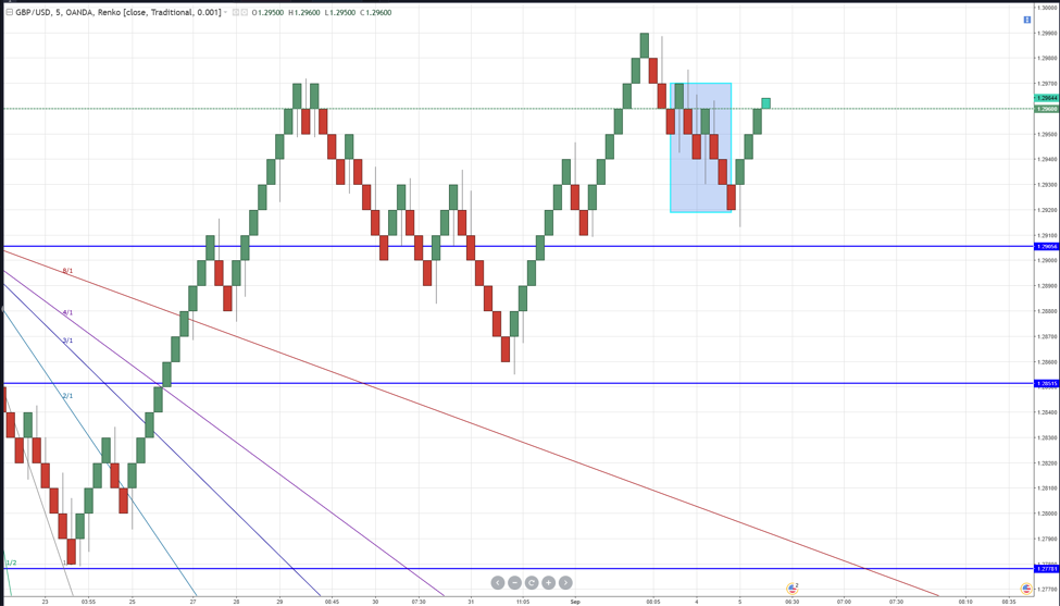
The best way to illustrate how this works is to look at a chart when you want to trade with candlesticks charts vs wanting to trade with Renko charts. In the image below, we see a five-minute chart of the GBPUSD pair.
The highlighted areas show 10 pips worth of movement. So only when the price completes 10 pips of movement down will a ‘red’ (in this case, fuscia) Renko brick form and only when the price completes a 10 pip move to the upside will a ‘green’ Renko brick form.
Pay close attention to the length of time it takes to form a Renko brick. Notice how it might take an hour for a brick to form or maybe, literally, only 5 minutes. Now let’s see the same thing translated to what it looks like if you trade with Renko charts.
The highlighted area displays the same time of trading as the candlestick chart we just looked at. This example I think is a good example of quickly showing how the charts are the same, but the perspective is different.
Trading with candlestick charts involves the element of time in the formation of the candlestick where executing a trade with Renko charts is devoid of time and only shows price.
Which one is easier to look at?
Which one is easier to read?
Renko Charts vs. Candlesticks
Let’s look at how simple it is to identify price trends with Renko versus regular candlesticks.
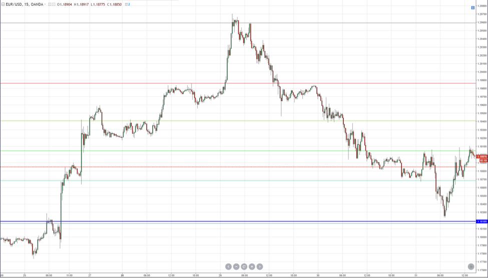
Let’s look at the EURUSD pair for this example. This recent chart is from August 25th, 2017 to August 31st, 2017. From this zoomed-out view, we can see the trend up followed by the trend down.
But look at all the noise between the swing low and the swing high. Are there areas on the movement of this chart where you would take profit early?
Are there areas where you could have been chopped around due to periods of consolidation? Ask yourself these questions as you observe this chart.
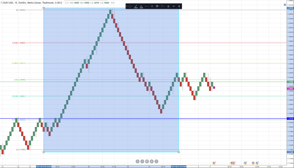
Now let’s look at that same chart, but with Renko bricks.
Now, I would challenge anyone to say that the candlesticks are easier to read than Renko bricks!
Depending on each individual’s timeframe and style of trading, the candlestick chart might cause some frustration and consternation for some traders. There are several areas where, just from price action perspective, you may want to exit your trade early.
Important: I still prefer using candlestick charts due to the trading strategy I am using. Renko is great for staying longer in a trade that goes in your direction. Renko is less noisy!
When you trade with Renko charts, you see such a cleaner and more neat representation of price movement. Executing trades with Renko charts ensures that you stay with the trend and you avoid the headaches and stresses that looking at regular charts can give you!
The Colour of Renko Charts
Change of color is another aspect of Renko bricks and how you might trade with Renko charts. When you see a change in brick color, that is a very strong indication of a change in direction for price.
So if we had a green Renko brick and then a red Renko brick, price didn’t just move 10 points to form that red Renko brick, price had to move 10 ticks from the green Brick and then a further 10 ticks to complete a red Renko brick.
That’s twenty ticks of movement!
If that doesn’t indicate some change in price direction, I don’t know what does!
Renko Bricks and Its Wicks
There is something else about Renko charts, specifically the Bricks, that even some users of Renko neglect to utilize and that is the ‘wicks’ on Renko bricks. I am going to use more illustrations to explain how powerful wicks are with Renko bricks.
Do you remember how the bricks form when you trade with Renko charts?
Every green brick means price moved up 10 pips and every red brick means price moved down 10 pips. Wicks represent a strong reversal of an attempt to move in the same direction as the previous brick.
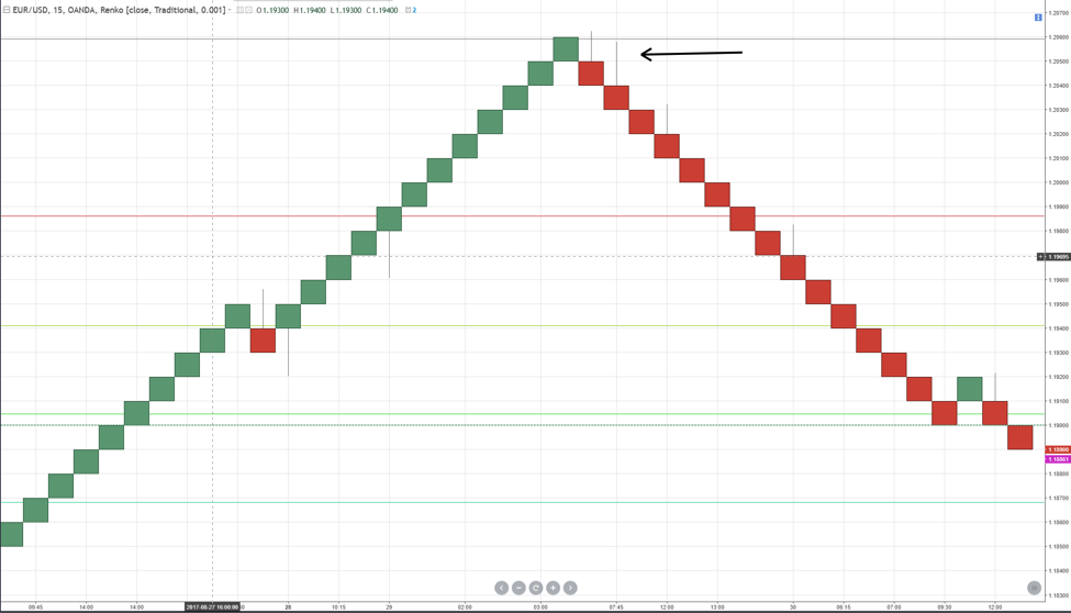
Let’s look at the same EURUSD pair and Renko chart we just looked at.
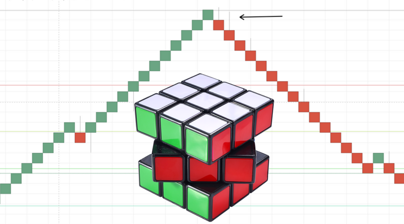
The red arrow here is pointing to two red Renko bricks with wicks.
A wick on a Renko chart means that the price attempted to move in the opposite direction of the Renko Brick but failed. The wick represents the length of the movement of price in the rejection.
So if you are going to try and trade with Renko charts, pay very close attention to a Renko brick with a wick, especially if the Brick has changed color from the prior brick.
Renko Charts and Divergences
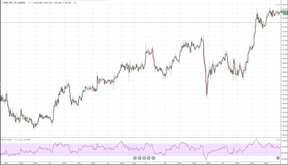
Now let’s see how Renko charts make it easier to observe divergences. For this example, we’ll use the GBPJPY pair and the RSI. For those of you who are unfamiliar with the RSI (Relative Strength Index), the RSI is a very popular momentum indicator and it is usually a standard indicator for many charting platforms.
Very simply, if the price is moving up, the RSI should be moving up. If the price is making lower lows, the RSI should be making lower lows. When those don’t happen, we have a divergence.
This is a 15-minute candlestick chart of the GBPJPY pair. At times it is easy to spot divergences and at other times, it takes a little time.
Seasoned traders can spot them quickly; beginner traders may have to look closely.
Do you see any?
Try and keep track of how long it took you to spot these divergences if you were to trade using candlestick charts.
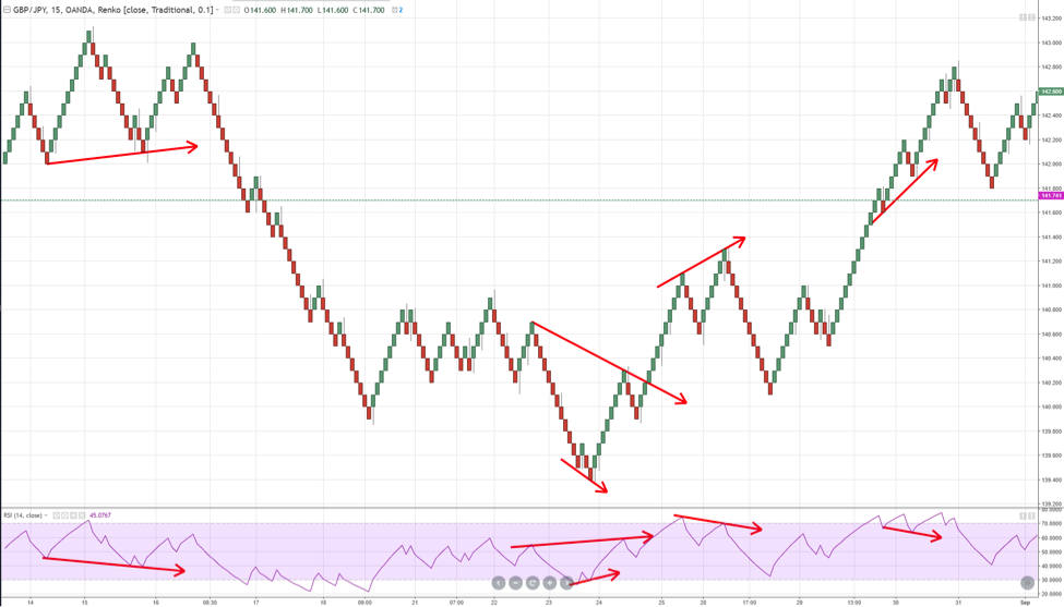
Now let’s look at a 15-minute GBPJPY Renko and notice how much more quickly you can see divergences if you were to execute a trade with Renko charts.
Notice how much easier these divergences in price and momentum are to see if you trade with Renko charts. Even minor divergences are noticeable. Compared with the noise factor and choppiness inherent in regular candlestick charting, Renko is a much more forgiving and easy way to see what is going on.
Important: This by no means is meant to indicate that Renko is better than Candlesticks. It is just another type of chart!
Renko Charts and Real-Life Examples
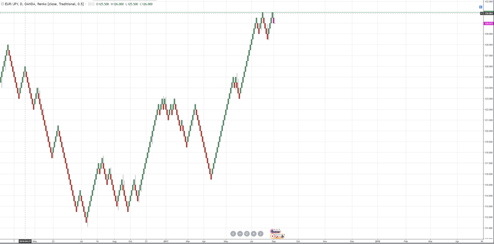
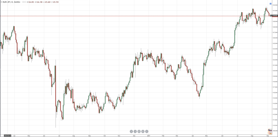
Now let’s observe identifying areas that are significant price levels or areas of support and resistance. Let’s look at the EURJPY pair.
If you were to trade using candlestick charts, how easy is it to find support and resistance? How far out do you have to zoom in to see these areas? I’ve been showing you the regular candlestick chart and then the Renko, but this time I want to start with the Renko chart.
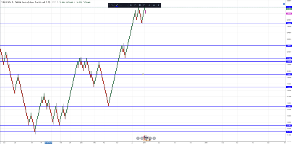
This is a 50-pip Renko brick chart of the EURJPY pair.
Look at how clean and neat those areas of reversal are!
Let’s see the same thing on a candlestick chart.
Renko Charts and Support and Resistance
You can see that there is a lot of similarity to these charts. But drawing support and resistance from the perspective of doing a trade-off a candlestick chart is more vague.
There is a lot of subjectivity and extra leg work that goes into identifying good and precise areas of support and resistance.
Let’s look at how much easier that would be if we were to trade with Renko charts.
Trading with Renko charts is a much more clear example of these areas of support and resistance. Now even if you prefer to use candlesticks, using Renko as your tool to find these price levels will translate marvelously to your normal candlesticks.
Important: I still prefer candlestick charts, since they are the best type of charts for price action traders. You can use Renko to just check if you are still on the right side of the trend.
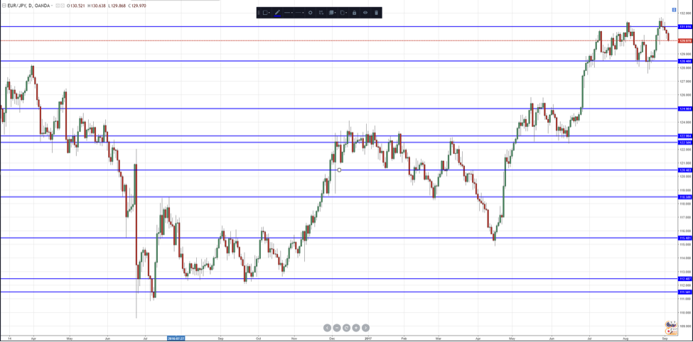
Let’s revert to the daily candlestick chart of the EURJPY pair, notice that we have not changed these blue support and resistance lines.
What I really enjoy seeing here is how trading with Renko charts confirms the Price Action Trading theory.
We can see candlesticks that are failed tests of area, double and triple tops, tweezer tops and bottoms, wicks penetrating key levels and being rejected, inside bars, etc.
It is almost like magic how much trading with Renko charts can be successful not only on its own, but how it can supplement traders who prefer to use candlestick charts, but just don’t like some of the headaches associated with using candlestick charts.
Renko Charts and Fibonacci
Fibonacci levels are another great tool used by traders. I find that the longer I trade, the more uncanny I find how traders and prices respect these levels.
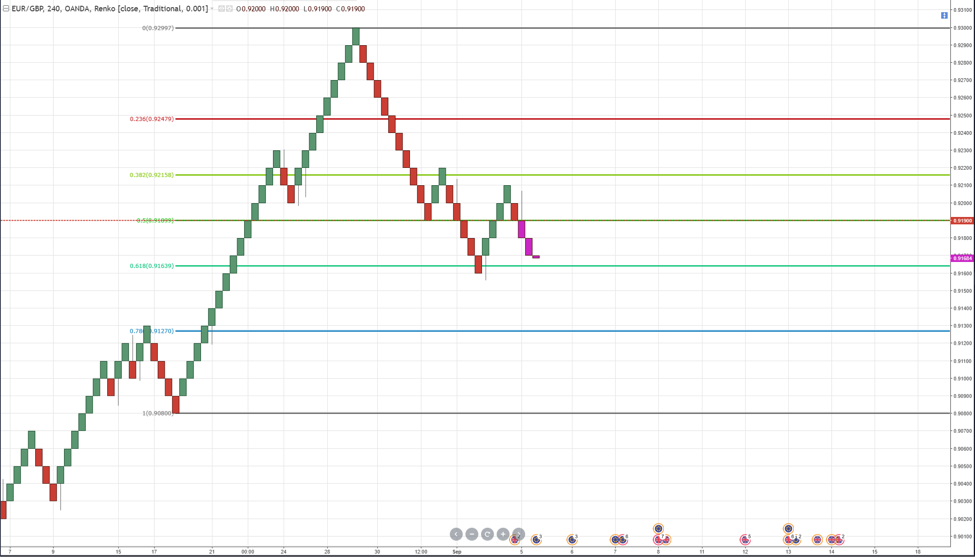
Because Renko filters out noise and leaves the formation of the bricks to price alone, we can get more authentic levels for drawing Fibonacci retracements.
Again, I am going to show the perspective of doing a trade with Renko charts first, then the perspective of doing a trade with candlestick charts.
Here we have a 10 pip Renko brick chart of the EURGBP pair. I drew a retracement from the most recent swing low to swing high. Again, look how clear and clean the movements are.
Now let’s see the transition from the Renko chart to the regular candlestick chart.
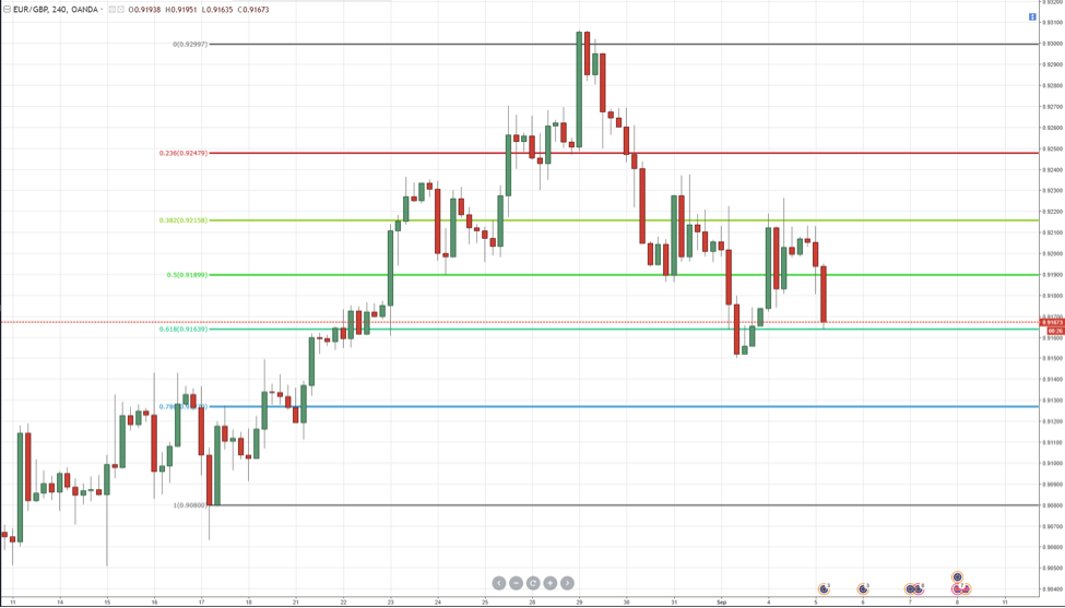
This 4-hour chart of the EURGBP pair shows how accurate our renko levels are/were.
Remember, I did not change anything on the Renko chart during the transition to the 4-hour candlestick chart, the Fibonacci levels remained the same. And it’s pretty fascinating when we observe this chart now.
Notice how much these candlesticks respect the Fibonacci levels from the Renko chart? We would have a different perspective if we were to do it the other way around, drawing from candlestick wicks to candlestick wicks.
Summing It Up
Trading with Renko charts is a fantastic addition to anyone’s trading regime. If you are a candlestick trader and want some confirmation or cleaner identification of levels, trends, and divergences, Renko can help confirm your candlestick analysis or even improve your candlestick analysis.
I believe that starting with a bias from trading with Renko charts and then implementing candlestick trading theory is a fantastic approach. You don’t have to trade just Renko!
And for those of you who have struggled with all the other various forms of charting, or maybe you are just an anxious trader who gets freaked out every time there is a candlestick doing something big and important, then Renko could be the perfect fit for you.
Renko helps keep your head clear and it keeps you longer in the trend. I truly believe that Renko is something that can help traders who hate looking at their screens all day but can’t stand the temptation to do so and then begin to become their own worst enemy because of one or two rogue candlesticks.
A trade with Renko charts will help you prevent getting chopped around by your anxiety.
Happy Trading,
Colibri Trader
P.S.
>> See Why 96% of Traders are LOSING and How YOU Can Capitalize On It <<
or check out another less-known type of chart- Heiken Ashi and learn more about how traders use it
Trading queries? Shoot me a message at admin@colibritrader.com – I’m all ears!




wow thanks very sir i really do appreciate your work. It has really improve my knowledge of trading
Thanks! Let me know if you have some questions!
Thank You