Markets Vs Nature
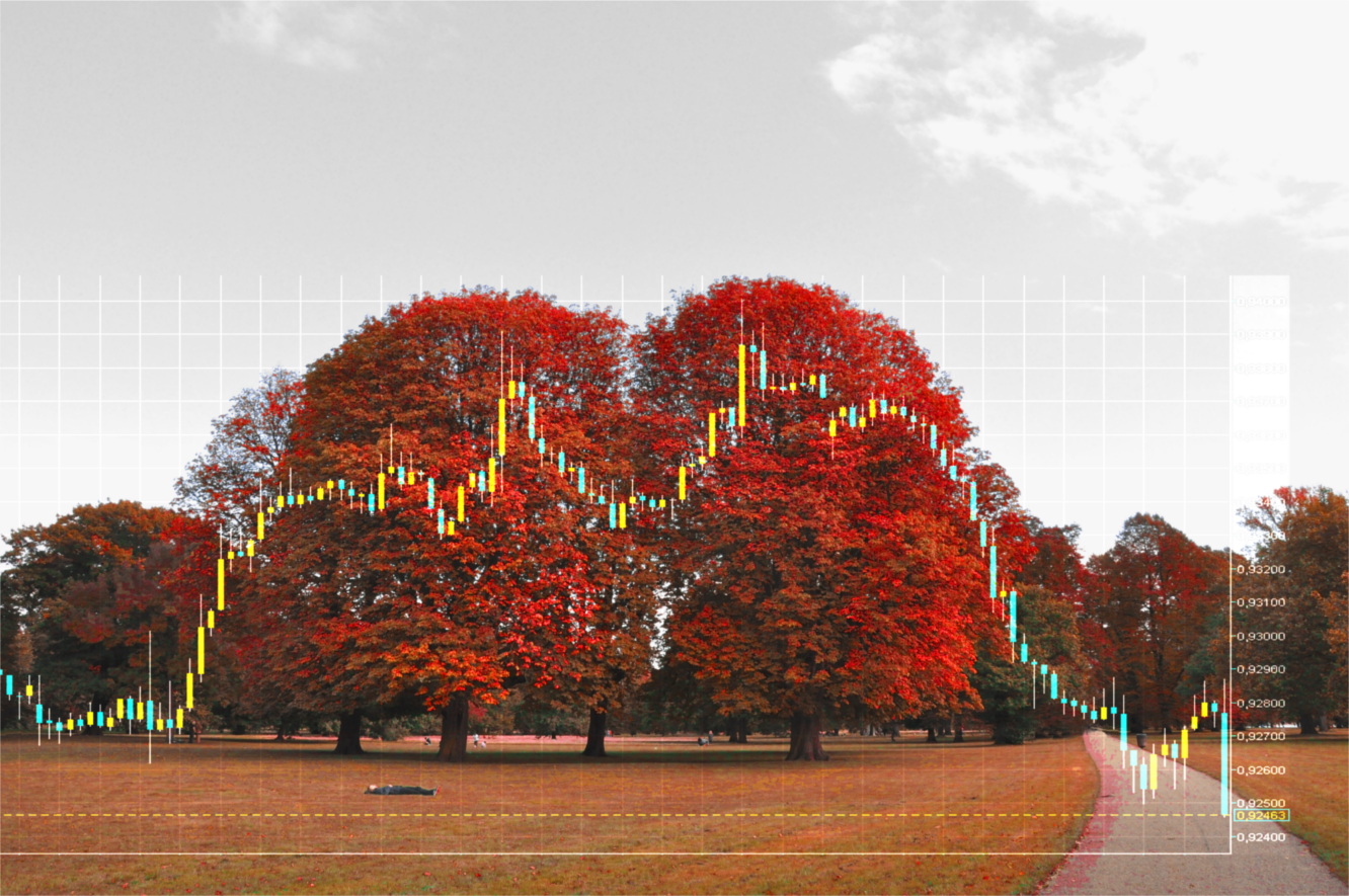
WHILE trading in the past decade, I have been inspired by the many similarities between the nature surrounding us and the financial markets. I have finally spent some time researching those similarities and have come up with a tangible illustration of the way financial markets resemble nature. It would be surprising to many traders how many of the shapes that are common in the environment surrounding us could be found in the behavior of markets. For the purpose of simplicity, I have interpolated graphs of different markets on top of a landscape picture. The first picture above (taken in Kensington Gardens) you do see twin trees, which naturally trace the price of USD/CHF. The curve of the chart, forming a double-top pattern made us curious whether those patterns could be found in other forms of nature…
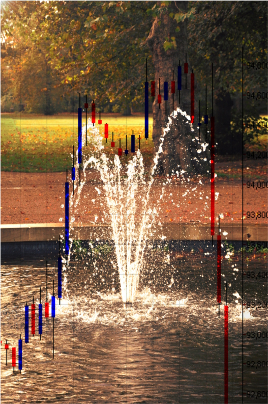
In the next picture, the price of the EUR/NZD follows the track of the water droplets of this fountain forming another beautiful double-top pattern. It’s an almost perfect fit, where it’s still not thoroughly quantified whether it is a striking coincidence, or nature is a perfect match of the markets.
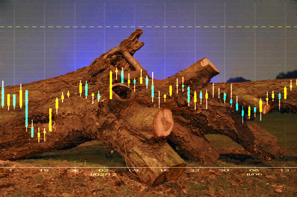
The photo above shows the surface of a fallen tree. You can find a stunning resemblance between this fallen tree trunk and the price of USD/JPY. The market pattern can be described as a “range”, or a moment of tranquility and it literally describes the state of the tree.
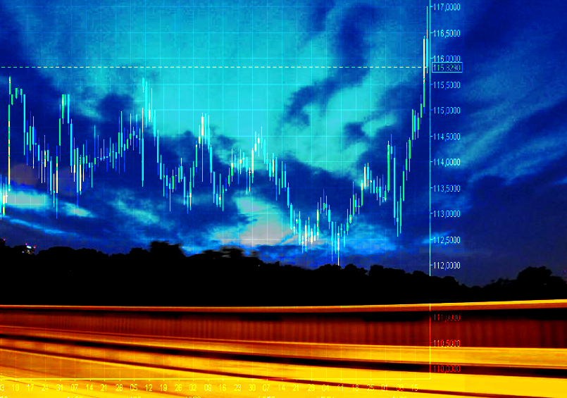
The following photo is taken on a highway in Washington. The resemblance between the twilight and CHF/JPY is striking. It is amazing how the shape of the clouds falls and then rises in tandem with this currency pair.
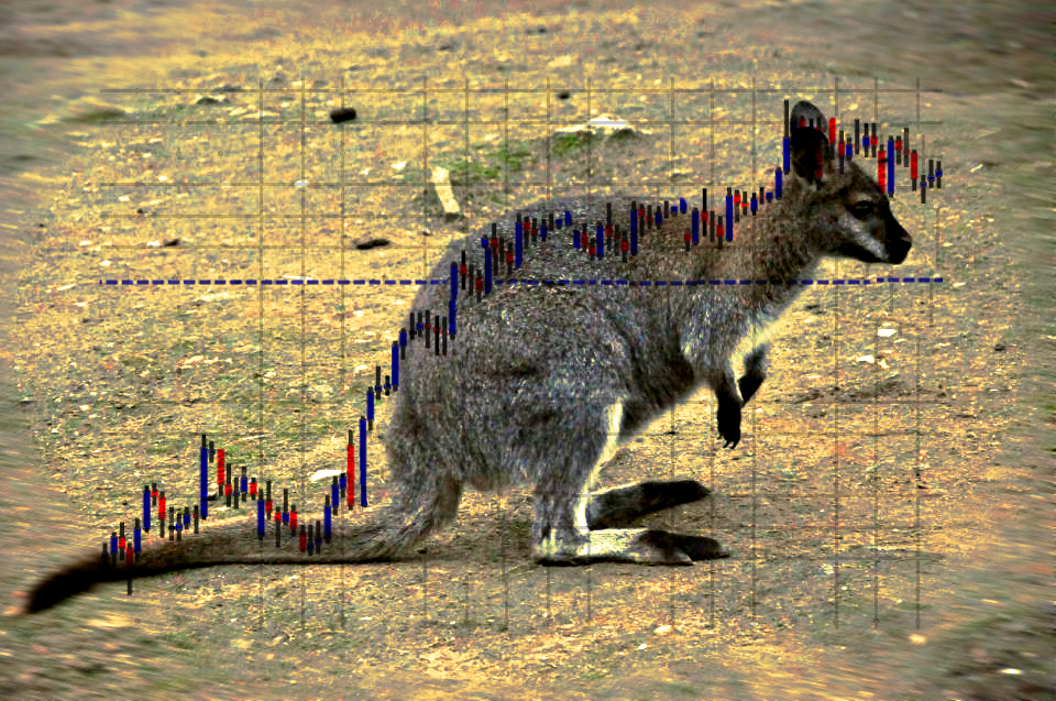
Another picture taken in Australia is showing an Australian Wallaby. The curves of this elegant animal are sharing a striking similarity with the price pattern of another currency pair- EUR/JPY. We leave for the trader to decide, which direction the market will take… or maybe the wallaby will decide to leap first.
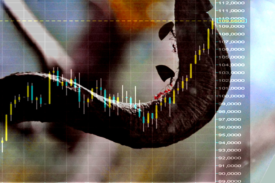
In a continuous search for more natural patterns occurring in the financial markets, we have found that the shape of this tree branch in Hyde Park is amazingly close to the price of Oil for the period between Nov 2011- Mar 2012, where it rose almost 18 USD. With a bit more imagination, we can predict the price of oil by following the little steps of the ants going up the branch.
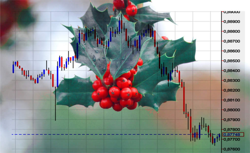
The chart above shows the price of the AUD/USD. Resembling a classical “Head and Shoulders” formation the currency pair is outlining the shape of an evergreen holly tree leaf, giving us one more reason to believe that there is nothing more natural than the simultaneous movement of price and nature.
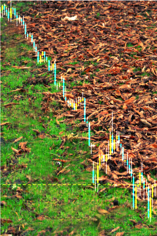
The last photo is of a foliage and does resemble the price of GBP/USD. The contrast between the last green leaves of a passing summer and the brownish color of the autumn is giving the outline for this striking similarity. In the end, what could be more disturbing than a falling market!

