How to Trade with Kagi Charts- Some Less Talked About Truths About Those Magical Charts
How to Trade with Kagi Charts- Some Less Talked About Truths About Those Magical Charts
Initially used in Japan in the late 1800s, Kagi charts discount the time we see on a regular price chart. Unlike candlestick and bar charts, Kagi charts are time independent, displaying potential supply and demand levels on any particular asset.
For this reason, many traders view Kagi charts as critical when using price action. They filter the noise in the market and only reveal the price changes that matter.
In other words, Kagi charts track the price movement of the market. But, in doing that, it considers only one variable: the price.
In this article, we will look at how to use Kagi charts in such a way as to better ride trends and make the most of any market. If you find point and figure charts useful for understanding the market, then you’ll love Kagi charts for their interpretation of the market.
Here is a quick video to jump start this article:
Contents in this article
- The Elements of Kagi Charts
- Understanding Kagi Charts Construction
- Using Percentages to Plot Kagi Charts
- How to Trade with Kagi Charts in the 21st Century
- Riding Trends with Kagi Charts
- Generating Trading Signals with Kagi Charts
- Step 1 – Pick a Chart and Draw the Relevant Trendline
- Step 2 – Spot the Reversal on the Kagi Chart
- Other Ways of Using Kagi Charts
- Divergences with Kagi Charts
- AUDUSD Divergences Examples
The Elements of Kagi Charts
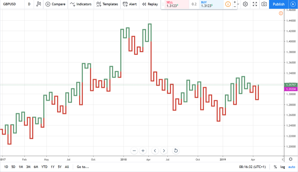
The only thing you’re about to see on Kagi charts is a line. A common representation of it has two colors, green and red, signalling the bullish and bearish market conditions.
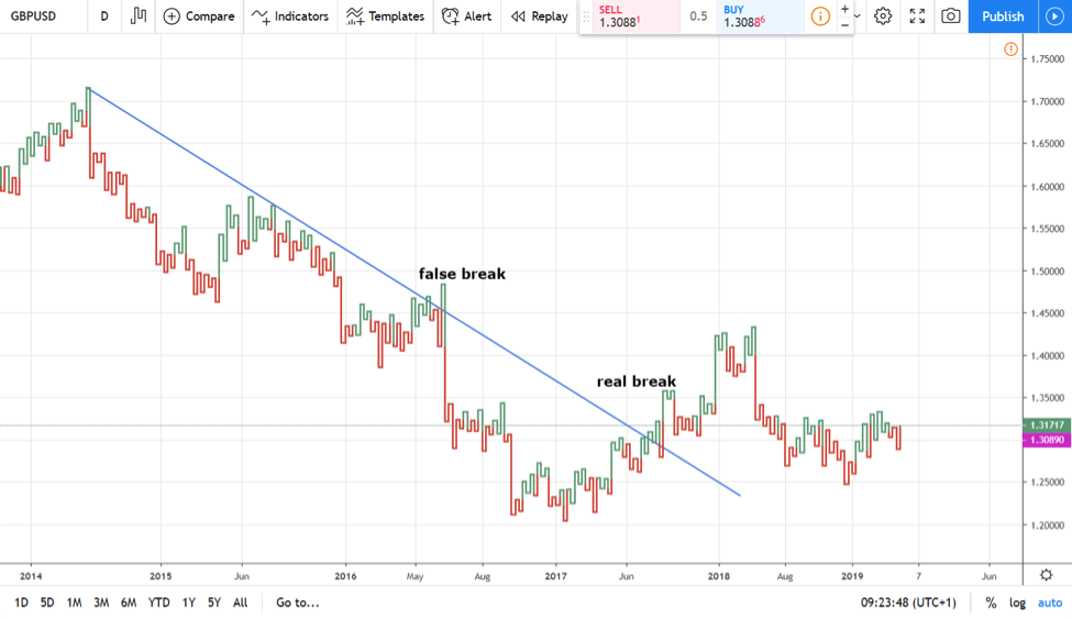
Here’s the GBPUSD daily timeframe. Focus on two things:
- the actual chart that shows U-turns, green and red ones
- the timescale at the bottom of the chart
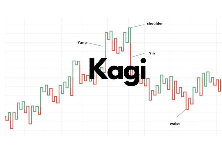
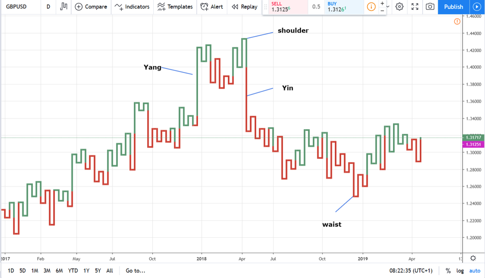
The U-turns are infection points, also called shoulders (a green U-turn) or waists (red U-turn). Moreover, the green line is called the Yang line, while the red one is the Yin line.
Besides these particularities, Kagi charts distort the time. A quick look at the chart above shows that it shows the price action for the last two-and-a-half years.
If you try to grasp the price action for the same period using a classic candlesticks chart, there’s no way you could do that in one screenshot. Therefore, we can say that Kagi charts only present the relevant price information, making it simpler and easier to spot and ride trends.
Understanding Kagi Charts Construction
At the first glance, a Kagi chart looks like a snake. Or, a line that simply rises and falls on the screen.
Just like Renko charts and point and figure charts, Kagi charts account only for the relevant price action. Therefore, it is no wonder that it filters for the days when the price moves less than the minimum distance needed.
To continue, Kagi charts plot a new value (or, the line continues) only when the price exceeds a predetermined distance. Depending on the market, the distance differs greatly.
Back in time, there weren’t so many markets to trade. In fact, Kagi charts originated from the rice market, and the price movements followed specific patterns. It was a very different environment from today’s financial markets.
For instance, nowadays the currency market is formed of multiple currency pairs. But, the price action on each pair differs from each other.
Some pairs have an extended price range on a daily basis, while others are known for consolidating more. Just compare the daily GBPCHF with the AUDNZD pair and you’ll see that the first one travels extended ranges.
In other words, if traders use the same predetermined price change for all markets, the Kagi charts aren’t that relevant. As mentioned above, each market has its own characteristics.
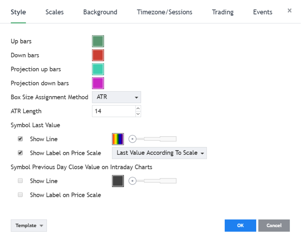
For this reason, today’s trading platforms use the ATR (Average True Range). And, the typical period considered is 14.
In other words, for the Kagi charts to plot a value, the price action on any given day must exceed the ATR(14). This way, it adapts to each market, and only the relevant moves appear on the chart.
Using Percentages to Plot Kagi Charts
Another way to plot Kagi charts is to use percentages. For instance, the chart only plots values if and when the price exceeds a 1% daily move. Therefore, it will ignore the “noise,” or the irrelevant days when the market simply consolidates.
And, it will account only for the days with relevant price action. This way, Kagi charts are useful in riding trends and staying on the right side of the market.
We can say that Kagi charts resemble Renko and point and figure charts in a way. However, when compared with both, Kagi charts have better use in following the trend.
The explanation comes from the way the three charts are constructed. The point and figure, for instance, builds mostly on the horizontal and vertical, using a series of Xs and 0s. It saves a lot of time, but such an approach also makes it difficult to see the relevant trends.
On the other hand, Renko charts (brick charts) add a new brick with every price sequence. But, in doing that, the advantage of filtering the moves using relevant price action, disappears.
How to Trade with Kagi Charts in the 21st Century
Before looking at various ways to trade financial markets using Kagi charts, there’s one thing to mention. That is, Kagi charts aren’t available on all trading platforms.
The most popular trading platform among retail traders, the MT4, doesn’t offer Kagi charts. Indeed, one may import a custom indicator that builds Kagi charts. But they don’t come with the default settings, and, sometimes, don’t come for free.
Even the TradingView platform used here, charges for Kagi charts that show the price action on lower timeframes. In other words, it is a sign of how important Kagi charts are and how relevant the information they provide is.
Riding Trends with Kagi Charts
Trendlines have a better use when applied on Kagi charts. Because Kagi charts only show the relevant market moves, the trendline filters false breaks.
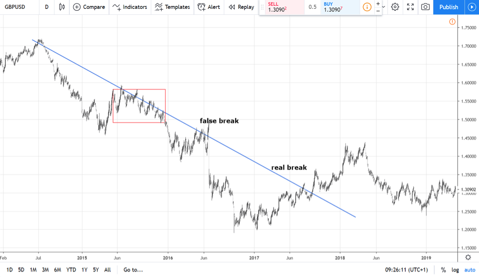
The Kagi chart below shows the GBPUSD price action since the middles of 2014. The bearish trend suffered a false break, easily filtered by the trendline.
Focus on the Kagi where the false break on the chart above appears. The green line breaks the bearish trendline, doesn’t it?
True!
However, the U-turn, or the shoulder, reverses and closes below the trendline. Basically, it tells us the trend remains intact.
Two times in a raw the price tried to break the trendline. It failed in both cases.
In the end, it managed to break higher. As the real breaking point shows, when a shoulder ends above the bearish trendline, the break is for real. While lagging a bit, it helps remaining in the relevant trend.
A quick comparison with a regular, candlesticks chart, tells everything. The red-squared area below shows how many times the price broke the trendline, making it challenging to remain on the bearish trend for longer.
Therefore, we can say that:
- Kagi charts help better defining bullish and bearish trends
- the resulting trendlines have more relevance for the price action
- false and real breaks are easy to spot and interpret accordingly
Generating Trading Signals with Kagi Charts
In the previous section of this article the Kagi charts were used to spot false and real breaks during trending conditions. Only using this feature of Kagi charts it’s enough for improving a trader’s performance.
However, because Kagi charts distort the time element, they confuse many traders. The solution to fully understand how Kagi charts work is to take a step by step approach.
Here’s what we’ll do next. First, we’ll spot a trendline’s break using Kagi charts, just like the one illustrated above. Next, the essential part is to spot the calendar date on the shoulder’s or waist’s reversal. Finally, switch the chart to a candlestick one and see the outcome of the generated trading signal.
Sounds like a plan?
Let’s do this!
Step 1 – Pick a Chart and Draw the Relevant Trendline
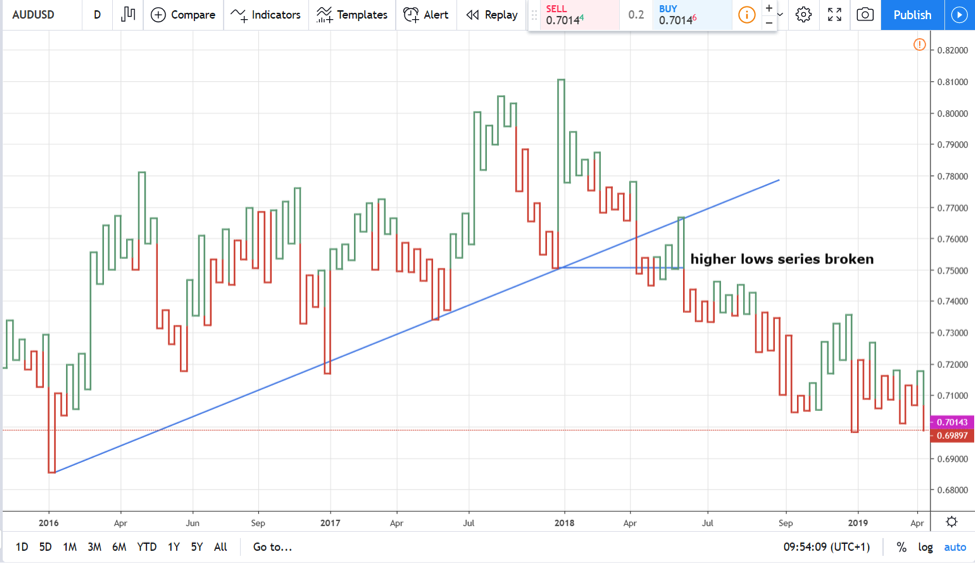
To alternate the examples, here’s the AUDUSD daily Kagi chart. Notice the rising trend from 2016 all the way into 2018. Next, the trendline breaks.
As showed so far, the mere break of the trendline isn’t enough. The rules of a rising trend tell us that it remains in place for as long as the series of lower highs exist.
Hence, a clear trendline’s break is one that sees the price breaking that series. The horizontal line on the chart above shows the moment the price breaks the higher lows in the series.
Now that we know we’re in a bearish trend, the idea is to focus on the shoulder’s reversal. Or, on the green lines that start falling.
First, wait for the shoulder to form. Next, look for the reversal. Further, check the calendar date on the Kagi chart. Finally, go on a regular candlesticks chart and mark the entry.
Remember, this is done only to prove the efficiency of using Kagi charts. In real time trading, the Kagi calendar day for entering a trade always corresponds with the current calendar day on any given candlesticks chart.
Step 2 – Spot the Reversal on the Kagi Chart
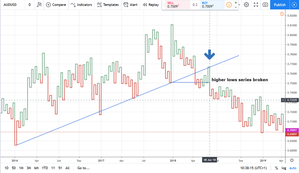
The first reversal on the AUDUSD Kagi chart comes to reinforce the short side. The price rises, only to retest the trendline. Basically, it offers a great entry.
However, at that point, at that high, we don’t know that a shoulder will form. Therefore, we need to wait for the Kagi chart to plot a new period. Soon enough, it did, and we mark down the Kagi chart calendar day: June 8, 2018.
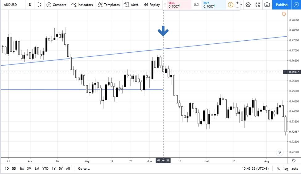
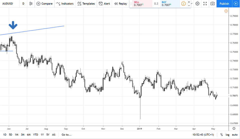
Next, we transform the Kagi chart into a candlesticks’ one. Finally, we consider the entering point the close of the candlestick on June 8, 2018. Here’s the outcome:
We see a corresponding value at the end of the trading day of about 0.76. A quick follow-through on the right side of the chart sees the pair dropping below 0.70 in the course of a few months. That’s the power of Kagi charts!
Other Ways of Using Kagi Charts
Oscillators work very well too when trading Kagi charts. However, the one thing to remember is that Kagi charts account only for the relevant moves. Therefore, the oscillator’s plotting line reflects only those moves.
It means that the standard interpretation of an oscillator won’t work the way it is supposed to. Hence, traders should adapt to the new circumstances.
Take the RSI (Relative Strength Index), for instance. As an oscillator, it travels only in positive territory.
Moreover, values above 70 or below 30 show overbought, respectively oversold conditions. But, with Kagi charts, the RSI rarely travels beyond 70 or 30. Therefore, trading overbought and oversold levels with the RSI won’t work with Kagi chart.
Nevertheless, there’s one approach with the RSI that proves to work just fine with Kagi charts.
Trading divergences.
Divergences with Kagi Charts
Divergences are one of the favourite ways to trade with oscillators. Because oscillators consider multiple periods before plotting a value, traders always rely on what oscillators show, rather than on what the price tells.
In the case of Kagi charts, the oscillator’s info is even more important. Consider that an oscillator placed on a regular candlesticks chart uses a standard period. In the RSI’s case, that period is 14.
Effectively, it means that it checks the previous 14 candlesticks on the main chart. Next, it applies the RSI formula considering all the info in that period. Finally, it plots a value based on the result.
But on Kagi charts, it applies the formula only on the periods where the price moved according to the Kagi rules. Hence, the period involved, while still 14, it expands in time for much more than 14 regular days (if we talk about the daily chart).
AUDUSD Divergences Examples
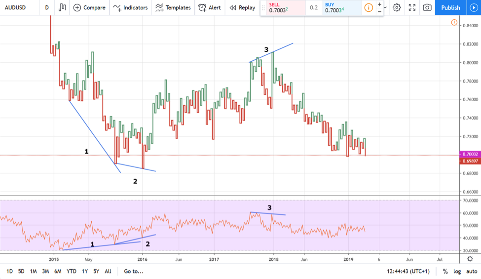
As always, examples help. Here’s the daily AUDUSD Kagi chart.
At the bottom of it there’s the RSI(14). However, it doesn’t consider the last 14 trading days. Instead, the RSI considers the last 14 days when the Kagi chart changed.
A quick look at the RSI values and we see that in the last four years (2015-2019) the price only reached oversold conditions once. Therefore, it is irrelevant to wait for overbought or oversold conditions when using Kagi charts.
But it makes sense to use divergences. If anything, Kagi divergences are much more powerful than the regular ones as they filter for the market noise.
From left to right, three examples appear on that chart, marked with numbers. Before discussing them, here’s a quick reminder what a divergence is:
- when the oscillator fails to confirm the second lower low (in a bullish divergence) or a second higher high (in a bearish divergence), the oscillator and the price are said to diverge
The first example sees the Kagi chart making two new lower lows. However, the RSI fails to make a new lower low, entering a divergent mode.
Furthermore, in the second example, the price pushes for yet another lower low on the Kagi chart. Yet, the RSI remains stubborn, failing to confirm this one too.
It is said that the RSI forms a double bullish divergence. Considering that it appears on a Kagi chart, it is even more powerful than one on a classic chart, for all the reasons we mentioned in this article.
The price jumps about a thousand pips from that moment on, reaching values over 0.80. But, in doing so, it forms a bearish divergence with the RSI, as illustrated in the last example on the above chart.
Conclusion
Traders from around the world enjoy the privilege of using Kagi charts due to Steve Nison. Steve spent a lot of time in Japan documenting the old ways the Japanese used to forecast future rice prices.
He introduced most of the Japanese candlesticks techniques to the Western world. As well, he’s responsible for spreading the Kagi charts, how to construct and interpret them, and his work was praised by traders around the world.
Perhaps the only trading theory known to the Western world at that time, similar with Kagi, was point and figure trading. It too, filters for irrelevant consolidations and only accounts for when the market makes an important move.
But point and figure evolved in time, as technicians kept adding new rules, from one-box reversal to three-box reversals, for instance. Kagi charts remained the same.
We’re also privileged as traders in the 21st century to have computers and electronic trading platforms. Nowadays, a simple Internet connection and a broker’s account gives access to a plethora of indicators and historical data.
Building Kagi charts in the 21st century is as simple as turning the computer on. All it remains is to know how to interpret them, what they stand for, and what are the best ways to use Kagi charts.
This article strived to reflect the importance of the time element in trading. Theories that account for time filter the market noise, eliminate the emotional roller-coaster and the effort of watching the market every single day.
As such, traders can focus only on what matters. Namely, on the currency pairs where the price really moves, interpreting them and making a decision that matters for the trading account.
In doing that, it is very hard to miss important trends, making Kagi charts a must have trading tool that is part of every trader’s toolkit.
p.s.
All charts used here are taken from the Tradingview’s platform.
p.p.s.
Have you checked my recent article on Moving Averages?

