The RSI Indicator Explained
The RSI Indicator Explained
The American mechanical engineer and investor, J.Welles Wilder, developed some of the most popular technical indicators used today. These include the Average True Range (ATR), Average Directional Index (ADX), Parabolic SAR, and Relative Strength Index (RSI). In this article, a detailed review of the Relative Strength Index will be presented, along with real-life examples on the currency market.
by: Colibri Trader
RSI was featured in Wilder’s book „New Concepts in Technical Trading Systems“, and is still widely used today almost 40 years later. The RSI is, just like the MACD or Stochastics, a momentum oscillator, and requires therefore additional confirmation for opening buy and sell positions.
What does RSI stands for?
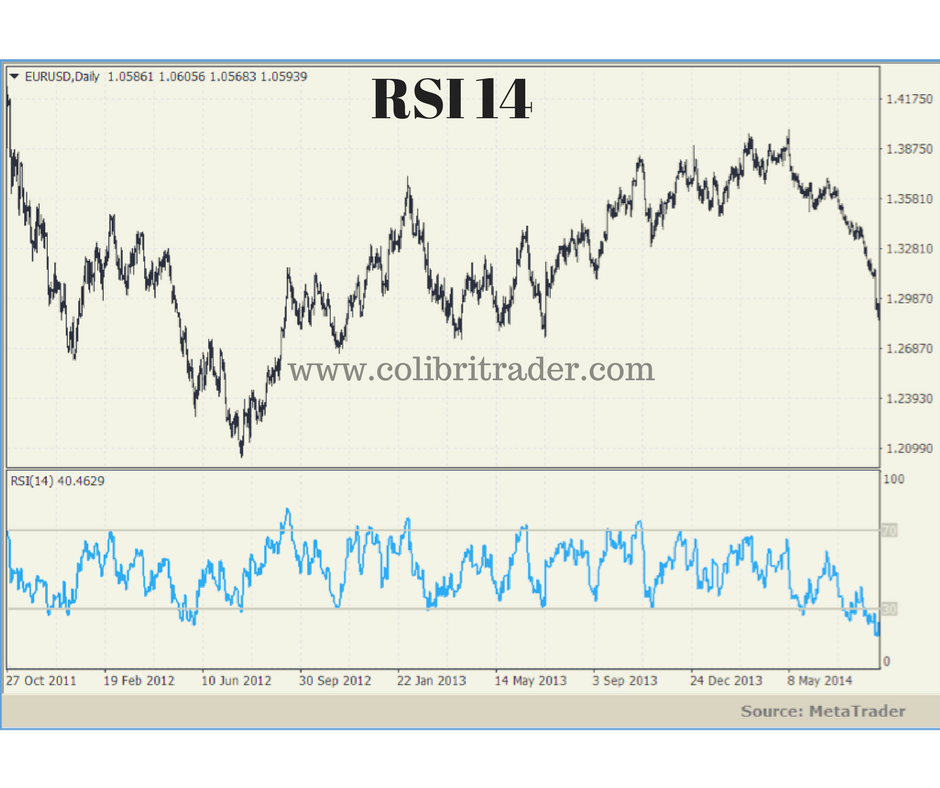
The relative strength index (RSI) represents the size of recent gains and losses, during a specified time period, and measures the speed of these price movements. It is therefore primarily used to identify potential overbought and oversold situations for a particular currency pair. Wilder recommends using a 14-day period as the standard setting for the RSI. The RSI has a higher value when the average gains for the specified period are larger than the average losses. In the opposite situation, when average losses are larger than average gains during the period, the RSI value moves down. The following chart shows the RSI indicator on the EUR/USD currency pair (blue), notice how the value of the RSI is normalised between 0 and 100.
The RSI can also be used on timeframes different than the daily, but traders need to pay attention that a shorter setting for the period creates a more volatile RSI, while a longer period creates an RSI less sensitive to price changes.
The indicator is calculated the following way:
RSI = 100 – [100/(1+RS)]
where,
RS = Smoothed Average Gain / Smoothed Average Loss
Average Gain = Sum of gains for the specified period
Average Loss = Sum of losses over the specified period
To create a Smoothed Average Gain, the following calculation is performed:
Smoothed Average Gain = [(previous Average Gain) x 13 + current Gain]
Smoothed Average Loss = [(previous Average Loss) x 13 + current Loss]
Wilder normalized the RSI with this formula to have a range value from 0 to 100. Simply said, if over the specified period each session was a gain, then the RSI would have a value of 100. If each session was a loss, the RSI would have a value of 0.
How to use the RSI in trading
- Identifying overbought/oversold areas
- Trading the RSI divergence
1. Overbought and oversold areas
A widely use of the RSI is for identifying when a currency pair (or another financial instrument) is overbought or oversold. The usual values of the RSI used for this are 30, which indicates an oversold area, and 70, which indicates an overbought area.
If the price moved strongly up in the recent periods, the RSI will react with a higher value. The presumption behind this is that a quick jump in price is usually not sustainable and will eventually result in a correction move down. Therefore, if the value of the RSI is 70 or more, it is considered an overbought area and traders should expect a drop in the price.
Similarly, a quick drop in the price will move the value of the RSI lower into the area of oversold conditions. In this case, it the RSI shows 30 or lower, traders should be prepared for a possible correction move upside.
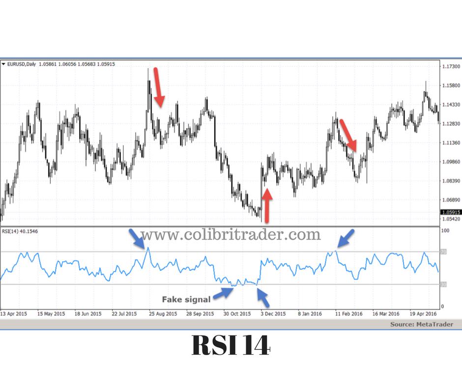
As the RSI is a momentum indicator, it can also often produce fake signals. Therefore, an additional confirmation regarding the direction change should be utilized. One of the popular ways of opening positions in case of overbought and oversold areas, is to let the RSI go above 70, and then wait for the value to break below 70 again to open a short position. In case of oversold areas, wait for the indicator to go below 30 and then to break above 30 again, for a buy signal. This is required because the RSI can remain in overbought and oversold areas for a long time if the currency pair is forming a new up or downtrend.
In the chart above, the blue arrows show possible signals for opening positions. Following the mentioned rules, on the first blue arrow the RSI went above 70 and returned below a short time after, creating a sell signal which resulted in a nice drop in price. The second arrow shows a fake signal, where the price continued to move lower. The third and fourth arrows point to a buy and sell signal, and the price reacted accordingly, creating a profitable trade opportunity. The stop-loss levels in this case would be placed on the previous swing highs for short, and swing lows for long positions.
2. The RSI divergence
A) Bullish Divergence
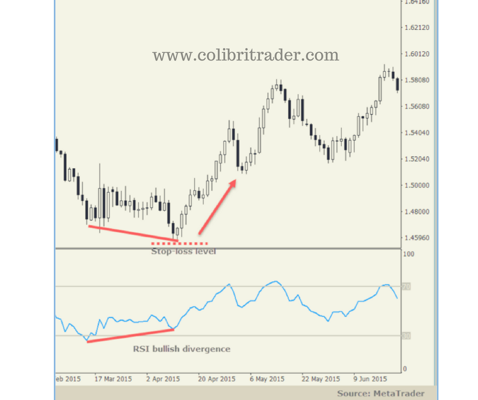
On this chart below, the RSI formed a bullish divergence on the GBP/USD daily chart. To find a bullish divergence, look for higher lows on the RSI and lower lows on the price chart. The RSI made a higher low but the price failed to follow the RSI, creating a lower low. In this case, a confirmation for opening a long position should be used, like for example candlestick patterns or confluence with another timeframe. The stop-loss level should be places just below the lower low on the price chart.
B) Bearish Divergence
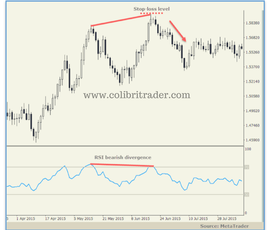
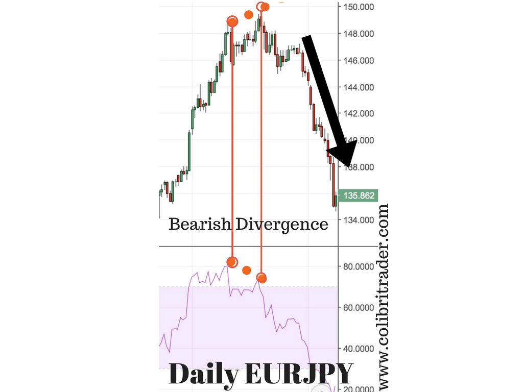
The following chart shows an RSI bearish divergence. The price made a higher high, compared to the RSI which made a lower high, thus creating a bearish divergence. On simple rule of thumb to identify these divergences exactly, is to imagine a bull and a bear. A bearish divergence is connecting two highs on the RSI, one being the higher high and the second being the lower high, and is plotted on the above the RSI (as if a bear moves the RSI lower with its clutches). A bullish divergence is plotted below the RSI, connecting a low and the next higher low (as if a bull pulls the RSI higher with its horns).
Real Life Examples
1.Example AUDUSD Bearish Divergence
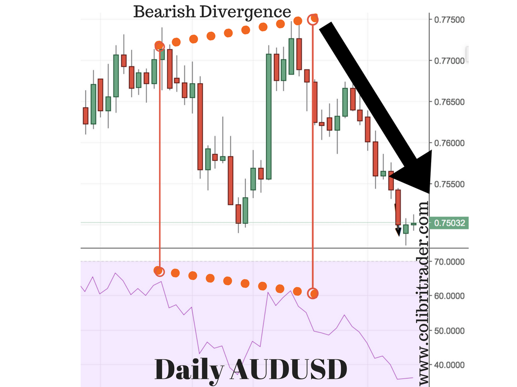
In the following screenshot, I am going to show you a bearish divergence. As you can see on the chart, the second peak is higher than the first one. At the same time, there is a divergence between the price chart and the RSI indicator. The RSI is not able to match those peaks and forms a lower second top. This confirms the bearish divergence and is an initial signal for a lot of short sellers. After this divergence, the price starts to gradually slow down and go lower.
2. Example GBPUSD Bullish Divergence
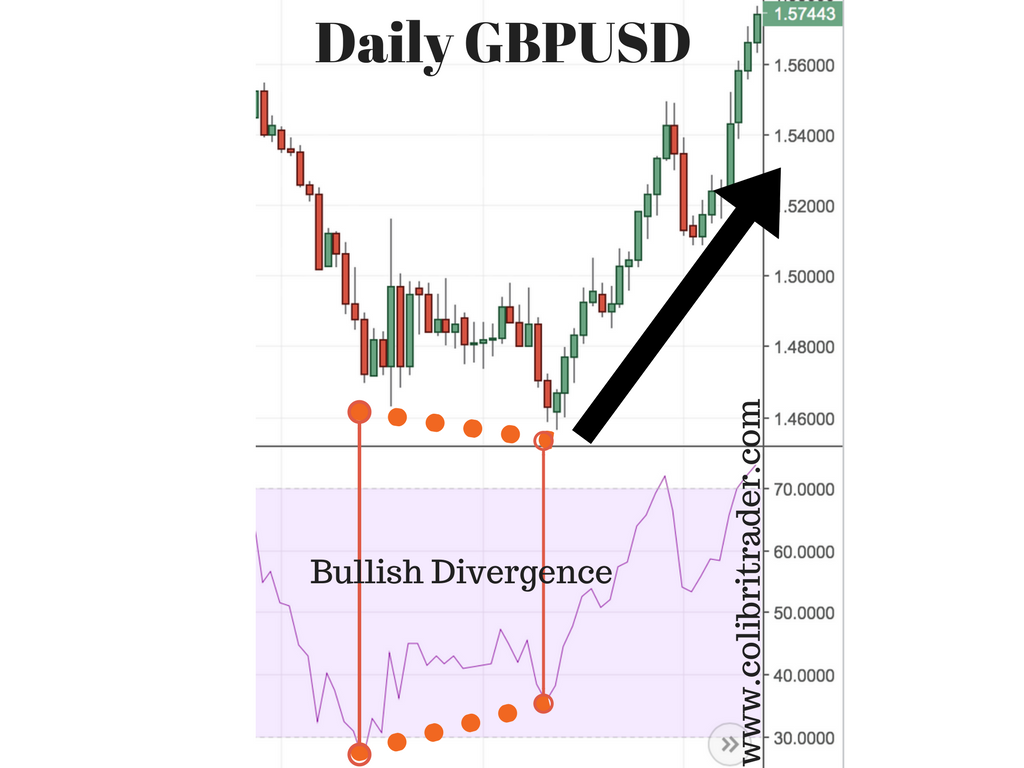
The second example is showing a bullish divergence on the GBPUSD Daily chart. Opposite to Example 1, this example is showing a bullish signal. If you look at the price chart, you will see two little bottoms connected with a dotted red line. The second one is lower than the first one. If you look at the RSI indicator below, you will see that the second low that matches the low from the price chart is higher. There is a divergence between the price chart and the RSI indicator plotted below the chart. This leads a lot of buyers to conclude a new bull trend has started. A confirmation from price or another indicator might be used to enter in a long trade.
3. Example EURJPY Bearish Divergence
The third example is showing a negative divergence between the Daily EURJPY chart and the RSI Indicator. I have chosen this example, because the distance between the peaks is very small, but the divergence is still valid. As long as you have two neighbouring peaks and a divergence, this is a valid initial indication. You will need to have another confirmation before you act, but it is a valid divergence. As with Example 1, this divergence is showing a higher high on the chart and a lower high on the RSI indicator. Hence, the negative divergence which finds a lot of sellers.
Conclusion
The RSI is one of the most popular technical indicators. It represents the size of recent gains and losses, during a specified time period, and measures the speed of these price movements. Like all other momentum-oscillators, trading signals from RSI should be confirmed with other non-momentum indicators. The most popular uses of the indicator are for identifying overbought and oversold areas, and price divergences. For overbought and -sold areas, the RSI has to reach a value of 70 and 30, respectively. Some traders also use the levels 80 and 20, to minimize fake signals produced by the RSI. Divergences are divided into bearish and bullish ones, with the first appearing when the RSI makes a lower high, but the price makes a higher high. A bullish divergence is the opposite, appearing when the RSI makes a higher low while the price makes a lower low.




Great article colibri trader.
Question: In paragraph A) Bullish Divergence, shouldn’t it be “higher LOWS on the RSI and lower lows on the price chart”?
similarly, in paragraph B) Bearish Divergence: shouldn’t it be “The price made a higher high, compared to the RSI which made a lower HIGH”?
thanks for providing this content.
Hi Chris,
You are absolutely right. I have just corrected the typo and now is as it should be. Having said that, what are you trading? What would you be interested to read about? Share with the rest your opinions and let’s keep connected- nothing is more important in this game of strategy!
Thanks for great article. Just a question as you mentioned it should be used with other indicator will you suggest which indicator will be best to use.
Thanks
Hi Hassan,
It could be used in conjunction with other indicators. You could use it for example with Support and Resistance and price action.
Hi.
Thanks, colibri for this article. It is clear and concise. It has helped me a lot.
I have always asked myself the following question about RSI and I have not been able to find a book that answers that question:
The results from an RSI of 14 previous days COULD be used for Intraday operations (various trading operations by hours or minutes)? Or, an RSI of 14 previos days SHOULD be used only for a One-day closing operations (trading for closing price)?
The results of RSI are calculated with closing values for each day.
Please, what do you think?
Thanks.
Regards.
Hi Gustavo,
Thanks for writing. The results are based on closing prices. RSI is a good indicator, but like every other indicator it has its own limitations. I would not use RSI on its own- that is what I have described in my trading course- can’t remember if you took it or not. But please ask me if you have any other questions- would like to be helpful 🙂
Good luck,
Colibri
did you mean Smoothed Average Gain = [(previous Average Gain) x 13 + current Gain] / 14?
Hi Marina,
I meant it as it is 🙂
Great !
I am already using this &it’s really work.
Thanks for such a great knowledge.
Glad you are finding this helpful, too!